Sunday, December 13, 2009
Sunday, December 6, 2009
Bind-in Blow-in cards
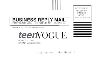
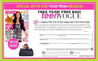
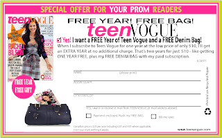
So this was probably the hardest project that I faced all semester because of how exact and precise they had to be.
The first card in the blog is the Business Reply Card that I made on Quark.
what went right: the first thing that went right was the size of the object. I was able measure the card and set it up on the program. This card was relatively simple because it does not have that much stuff on it, just lines and the spaces for the mailing information. The easiest thing on this whole project was finishing the fonts. for everything on the page, except for the teen vogue title, was exactly the font that Quark was already set in. so I just had to type and the program fortunately found the font for me.
challenges: the challenge of this card were the small little lines across the bottom of the page. not only did i have to figure out how many lines were across the bottom but also how many small versus large lines there were, how long/short they had to be and the pattern of long to short lines. It was the final thing I did on the entire card and by far the most tedious thing to work on for probably the entire project.
how solved: This was really a try try again approach. I copy and pasted a whole bunch of longer lines and aligned them next to another with hopefully enough distance between them. when I got the right amount of lines across the bottom, I started making them shorter or longer then depending on the pattern on the actual card. I tried to space the lines as close to what was on the card as possible and make them along the same line across the bottom. It is not perfect, but I got it as perfect as I could get it and was pleased with the outcome.
The Blind in Blow in card in Quark:
what went right: The set-up of the whole card went right because I decided to work with InDesign first, so basically everything from the fonts and colors to images had already been established from the first card. This made it extremely easy to work on the card in Quark since everything was well established.
challenge: The challenge here was the spacing of all the objects. In InDesign, when I had to create the lines that customers fill out, the program automatically spaced the lines out. I would just place one and position it the distance between the two that I measured out on the actual card and it would make them all evenly spaced. In quark I had to do a little more work on that. Also there was a small issue with the image of the recycling sign on the side of the card. When I created the image and placed it into the program, it showed up and was fine. when I would print out the card, an image I found of a yellow purse was in its place.
how I solved it: in regards to the spacing, I placed the lines across the top and in the corner over the green and pink border and when it was all placed and measured it out, I would move i down to were it was. I tried to follow the measurements and inches the best that I could. In regards to the image of the recycling sign. I went to other computers to print this card and found the image of the black recycling image and replaced it into the card while saving it into my file. with it saved onto the computer that I printed the card from, it worked out fine.
The blind-in blow-in card on InDesign:
what went right: This one took a while to get working since it was the first card the I worked on out of the three. The things that went right are the spacing and the coloring of the card. I was able to put the images into the right spacing because once i placed one image or line, it there was a group of lines together, such as the lines where a person fills out their information the program spaced them evenly for me. As for the color, it was a lot of trial and error, I would pace the cursor in a green patch and placed numbers in RGB until it looked right. I printed test cards when i had the color set and it was just about a perfect match. I found the green and pink colors, which were the only two colors not in an image I had to find, within ten minutes, which i was super proud of.
challenge: The challenges I faced in this program was finding all the different fonts and establishing everything. This took me about 3 hours because it has many different fonts and placements. Before i created the card, I measured out all spaces on the actual paper card and tried to place the images and words and lines in their right placement. Finding the fonts took the longest because of how many degrees that a font could appear. you could find the initial font that looked similar to what was on the card, but then you could either have it bold or regular, wide or thin, and light, semi-light, etc. some fonts have 10 different options. other than that, with this card, all the images, such as the bag with the other magazine side was in it, had to be made and placed in InDesign as a foundation for the Quark card. As for that image, that was also a challenge since i could not find the exact image i needed.
how I solved it: In regards to the font, it was really trial and error and just poking around the program and trying different fonts to see ow they compare. I still don't feel that I got the fonts 100% right but I tried to get them to as close as humanly possible. In regards to the purse the corner, that was problematic but I was able to fix it. I could not find the bag so i found one that was as close to the big as possible. I brought it into photo shop and erased the handle since there was none in the original image, and i placed it into InDesign. for the magazine,i brought it into the program as well and dragged it to the angle that it needed to be. I used the controls to brig the bag to the front of the card, thus making the magazine look like it was in the bag.
This was a very time intensive assignment but I think the end result speaks for itself. Super proud and I
Monday, November 23, 2009
Web Page
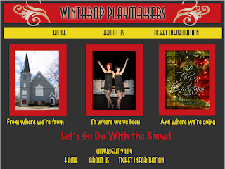
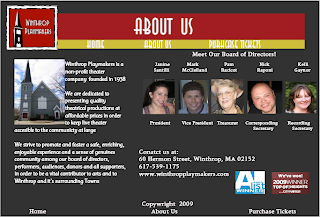
My job for the website was to work on the About Us page, while my partner worked on the home page. However, we did assist one another out through the process.
I knew that on the about us page, I wanted to have information about the Playmakers, The faces of the board of directors and contact information. We chose to have the emblem on the playhouse on the top with a banner that housed the about us title. We stuck with yellow underneath because it was the third color on the homepage and we wanted to echo it in the other page designs. I chose to put the information about the playhouse on the left of the page because it is the most important information about the playhouse and since people read from left to write, I wanted it to be the first thing they see. after that, I wanted to add photos near the top of the website and across so it didn't look cluttered in one corner of the page. Though I did not include every member of the board , I included those that are in the more head positions on the board and the ones that are always around the playhouse that you can talk to. I added the contact information below the board of directors so people will know how to contact the playhouse, and I added tabs about the awards the playhouse has one to show that it has a good reputation. I tried to add a lot of information in a bit of a small place.
Thursday, November 19, 2009
Winthrop Playmakers Brochure
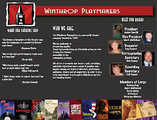
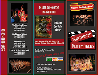
Out of the entire brochure, I worked on the three panels that were located inside. These included information about the playhouse itself, what some patrons said about their experiences at the playhouse, and a panel introducing the board of directors at the playhouse.
My target audience were those who would most likely attend the playhouse. If I had to choose an age group I would say more mature and older people since the brochure does not cater to children. The brochure was meant to be simply an introduction to the playhouse and a way to let current and future patrons know who we are, what we have done, and what they can look forward to in the future on our stage.
I set up each panel as a separate entity but I tried to include some pieces that made the inside united. The first panel was on the left side and it had quotes from those who had seen shows at the playhouse and what they thought of their experience. the middle panel had an about you section introducing people to the playhouse and I wanted to put that information in the middle panel because hat is the panel in the brochure when it is open that people's eye goes to first and foremost. The final side of the panel has the board of directors, including president, vice president, etc. all the way down to members at large . I wanted the brochure to speak in the simplest form and just let people know who the Winthrop Playmakers are. I feel like once that relationship is established, then it would be time to move on to more direct forms of getting people in to the theater.
I chose my color because it was what the Winthrop Playmakers currently has on the website. It is L21 gray and the images we used were pictures of the playhouse's logo and those on the board. across the bottom are images of plays the playhouse has done in the past in order to tie the three panels together. For the titles of each panel and the page, I used ITC Anna std because it was the closest font to what Winthrop had on their website and under that we used marker felt which gave what I felt, the Playmaker feel. Each font was Sans Serif since it is the easiest to read in the brochure.
I am most proud of the pictures across the bottom of the page for sure and also being able to deliver a brochure that really helped advertise a place that I absolutely love. The playhouse is my second home and being able to help them advertise was great to me. Being able to design the brochure, using their fonts and colors, and also delivering a message was great. It was also great to see how I advanced from not knowing any adobe or mac products to being well knowledgeable in their products.
I wish I had more time to work on the panel with the board of directors since each photo was not nicely aligned with who they are on the board and also their photos looked a little fun house mirror. I worked on it a bit but with printer problems and computer malfunctions, what i changed did not save so I had to print as it was before the edits.
I really liked InDesign. It worked very well and I liked it better than Quark. I don't think I really had an trials or tribulations when working on this project.
Monday, October 26, 2009
Music Poster
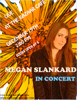
The next part of our sound portion of class was to design a music poster. I went in the complete opposite direction with my band, and went from a grunge, alternative rock band to a folk, acoustic guitar player names Megan Slankard. I originally saw her on television and have followed her music since. I know A couple of songs and always hunt for her CD when I am out.
Anyway, Her first album is a picture of her hidden behind a field of sunflowers, so I wanted to incorporate that into the poster. I found a picture of a sunflower and dragged it into photo shop. I used the magic eraser and erased all the edges so the sunflower looked like it was by itself, yet the petals had a bit of a zig-zag edge to them, in hopes to make it look like the sunflower exploded on the page. I found an image of Megan Slankard sitting on a chair. I originally wanted the image of her behind the flowers, but her face was extremely hidden so i thought this would be a better image. Again, I used the eraser tool and got rid of her bottom half, and the chair, plus all of the background color. I used a filter on the image to make it not so plain, and then put it on top of the sunflower. I was extremely proud that I was able to make the background a whole flower and make it pop without taking away from the rest of the poster, and use the tools and techniques I had learned in photo shop
In Quark, it was tricky to use the layering tool because it was different from photo shop. I wasn't sure where there was a new layer or not. I added text and then when I tried to change it, it would only create a new palette or style that I would have to click on to use. I found a puffy text that fit the style and mellowness of the artist and used that for the performance information. To make it not so static, I tilted the words to draw the eye up and into a Z. For the title, I found another simple font that added to the style of the artist and stuck with the shades of color I had been using elsewhere in the poster. I put the artist's name and in concert below here sort of near the bottom middle of the page, so as to be a little more creative and title the image of the artist present. I loved how all the text looked when it was completed. I am proud that I am able to make a poster that is not centered and stationary and actually create something I think looks nice and shows that I took time to work on it. It is really easy to make a poster with general information, but to make it eye catching was a lot of fun for me.
I also added on the bottom information where to go if you wanted more information, since It is always good to add that in case people have questions or want to know more about the event. I can see myself learning more and more about Mac's and design programs, and technology and I have never really gotten along before, but I and thoroughly enjoying all that I am learning and producing in this class.
Saturday, October 17, 2009
Music Slide Show
After the title slide was a slide with facts. I started by going into photoshop and creating a colored layered backgronund and filtered a photo of the lead singer onto it, and that became my background. I then found facts online and animated them in. I knew how to make things bounce and move in before but never how to make facts that were not prime dimmed, so poking around power point and doing research was huge for me this project. On this slide, I am most proud of making all the facts dim and all things moving by themselves.
The next slide was a picture of the album cover of my band and the tracks. I had a piano graphic along the bottomof my slide, as well as my album to the right of the info and my tracks, in a grunge manner, fly in, bounce into place, and state the title name and howlong each song is. This slide was the same deal as the prior one because I was not fully aware on how to dim the tracks before and make sure they didn't dim too fast before the next slide entered. I was really proud of how the fonts came out and of how smoothly this slide went.
The next slide was the chart. I decided to not look at ratings and numbers, but focus more on images that compared the for bands I picked, such as the band image and album covers. I also looked at the style of the music and the number of albums each band has released. Other than The Audition, I chose Paramore, The Backstreet Boys, and No Doubt. I was most proud of using the shape tool and creating my own chart instead of using a pre-made one that could be found on the internet. I enjoyed comparing the bands because they were each similar and different from one another, and how broad th spectrum of muic can be.
The final slide was a collage of pictures of the band I chose and a link where one can find more information about the band. I was super proud that I was able to time it so it stopped right when the slide show was done and also I was really proud of all the filters that I chose to use for the photos.
I also loved learning how to use audacity for the first time. It took a bit of getting used to because of all the buttons and features, but I really loved taking the songs I chose and cutting them into a seemless song that underscored my slide show. I learned so much during this project and it was so super simple to use. I have never been a wiz with a Mac and I feel like I can use programs with ease now.
Thursday, October 1, 2009
For the next part of our font poem, we had to create a video where our poem came over a collage that represented the words appearing. Due to technical difficulties, I did mine backwards. I made a video of my collage coming in and out, then once it was finished, the video flashed to my actual font poem, and then back so the reader could get a feel for my collage's representation of the words.
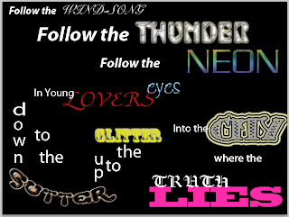
The poem is actually the lyrics from a song in the musical "Hair". The show is set in the 1960's and the words came from a song where the leading character, Claude, is about to make the decision if he should burn his draft card. The song is called "Where do I go" and I felt the words were extremely powerful as well as a good foundation to do crazy photo shop things to. The show itself is extremely colorful and full of hippies. I chose pictures of myself that echoed the words, such as myself in a dress covered in glitter, and a finger pointing down, or crazy hair that had been teased to represent the show and the gutter feel. also, lover's eyes and a shocked expression showing truth lies. I also thought it would be a nice touch to have part of my face painted, for a 60's feel. This was all set in front on neon, which isn't only a word in the poem but has the colorfulness that the show is about.
Monday, September 28, 2009
Font Poem
Sunday, September 13, 2009
Contact Sheet

The first row contains a picture that is 4 different dpi (dots per images). these went from 72, 300, 600, and 1200. The second row took a picture and dealt with color, from an image in the screen, an image if it was printed out, two tone and black and white photo. The third row dealt with a photo making it either landscape, square and portrait. The Fourth row dealt mostly with the zoom feature, and the fifth row had us zooming again, but not in the same style as the fourth row. the fourth row we focused mostly on different spots of a picture, but the fifth row was zoomed to the point of nonrecognition. The sixth row (in my opinion the most interesting) had us take a picture, go into photo shop and use different filters to make the photo of our choosing anything we want (I chose a picture from my time abroad in London and made it glow, cut out and grained).
In regards to this project, I wanted to create a contact sheet the was interesting to look at and was unique in the pictures chosen. That didn't work out so week with the first row since the butterfly I used has appeared in many other student's contact sheets before, but trying to find a photo that was originally 1200 dpi was like trying to find a needle in a hay stack, so I gave in and just used that one to get the message across.
I encountered problems because this is the first time that I have ever used photo shop or any of the other programs we used for this assignment. I do not own a mac nor have I ever used a mac for this purpose before so i was a bit worried in that regard, but luckily the instructions were really well delivered so after jotting down what i had to do and actually using the applications, it got easier as it went on. Row four, thus far has been the most problematic only because of a malfunctions image zoom, but I got there in the end
This project was a lot of fun because of the design aspect. Being a theater student and a fan of artsy things (math and science, thought necessary and interesting, really just isn't my thing), it was fun to find pictures that were different and make them different shapes, images, artistic representations etc. One of the reasons why I loved row 6 so much. also, I was glad I was able to learn these new programs. I have heard of photo shop many times in the past and how useful it can be, but again, being mac-less, have never used it or touched it, so being able to spend two weeks in class using this program was pretty awesome.
I am most proud of the fact that I was able to complete the assignment. I really wanted to learn something instead of sitting at a computer screen with the circuits malfunctioning in my head due to the complexity of the program. Being able to actually complete the project was probably a huge accomplishment for me and I was super proud. Another fun fact, technology and I sometimes have our differences. If I could got back and get more time for this project and change something, it would have to be that darn butterfly. I would have loved to find a different picture.
