

So this was probably the hardest project that I faced all semester because of how exact and precise they had to be.
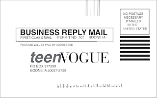
The first card in the blog is the Business Reply Card that I made on Quark.
what went right: the first thing that went right was the size of the object. I was able measure the card and set it up on the program. This card was relatively simple because it does not have that much stuff on it, just lines and the spaces for the mailing information. The easiest thing on this whole project was finishing the fonts. for everything on the page, except for the teen vogue title, was exactly the font that Quark was already set in. so I just had to type and the program fortunately found the font for me.
challenges: the challenge of this card were the small little lines across the bottom of the page. not only did i have to figure out how many lines were across the bottom but also how many small versus large lines there were, how long/short they had to be and the pattern of long to short lines. It was the final thing I did on the entire card and by far the most tedious thing to work on for probably the entire project.
how solved: This was really a try try again approach. I copy and pasted a whole bunch of longer lines and aligned them next to another with hopefully enough distance between them. when I got the right amount of lines across the bottom, I started making them shorter or longer then depending on the pattern on the actual card. I tried to space the lines as close to what was on the card as possible and make them along the same line across the bottom. It is not perfect, but I got it as perfect as I could get it and was pleased with the outcome.
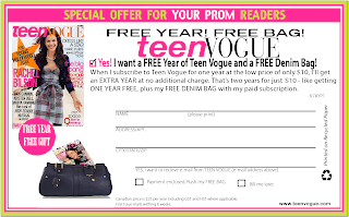
The Blind in Blow in card in Quark:
what went right: The set-up of the whole card went right because I decided to work with InDesign first, so basically everything from the fonts and colors to images had already been established from the first card. This made it extremely easy to work on the card in Quark since everything was well established.
challenge: The challenge here was the spacing of all the objects. In InDesign, when I had to create the lines that customers fill out, the program automatically spaced the lines out. I would just place one and position it the distance between the two that I measured out on the actual card and it would make them all evenly spaced. In quark I had to do a little more work on that. Also there was a small issue with the image of the recycling sign on the side of the card. When I created the image and placed it into the program, it showed up and was fine. when I would print out the card, an image I found of a yellow purse was in its place.
how I solved it: in regards to the spacing, I placed the lines across the top and in the corner over the green and pink border and when it was all placed and measured it out, I would move i down to were it was. I tried to follow the measurements and inches the best that I could. In regards to the image of the recycling sign. I went to other computers to print this card and found the image of the black recycling image and replaced it into the card while saving it into my file. with it saved onto the computer that I printed the card from, it worked out fine.
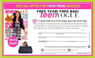
The blind-in blow-in card on InDesign:
what went right: This one took a while to get working since it was the first card the I worked on out of the three. The things that went right are the spacing and the coloring of the card. I was able to put the images into the right spacing because once i placed one image or line, it there was a group of lines together, such as the lines where a person fills out their information the program spaced them evenly for me. As for the color, it was a lot of trial and error, I would pace the cursor in a green patch and placed numbers in RGB until it looked right. I printed test cards when i had the color set and it was just about a perfect match. I found the green and pink colors, which were the only two colors not in an image I had to find, within ten minutes, which i was super proud of.
challenge: The challenges I faced in this program was finding all the different fonts and establishing everything. This took me about 3 hours because it has many different fonts and placements. Before i created the card, I measured out all spaces on the actual paper card and tried to place the images and words and lines in their right placement. Finding the fonts took the longest because of how many degrees that a font could appear. you could find the initial font that looked similar to what was on the card, but then you could either have it bold or regular, wide or thin, and light, semi-light, etc. some fonts have 10 different options. other than that, with this card, all the images, such as the bag with the other magazine side was in it, had to be made and placed in InDesign as a foundation for the Quark card. As for that image, that was also a challenge since i could not find the exact image i needed.
how I solved it: In regards to the font, it was really trial and error and just poking around the program and trying different fonts to see ow they compare. I still don't feel that I got the fonts 100% right but I tried to get them to as close as humanly possible. In regards to the purse the corner, that was problematic but I was able to fix it. I could not find the bag so i found one that was as close to the big as possible. I brought it into photo shop and erased the handle since there was none in the original image, and i placed it into InDesign. for the magazine,i brought it into the program as well and dragged it to the angle that it needed to be. I used the controls to brig the bag to the front of the card, thus making the magazine look like it was in the bag.
This was a very time intensive assignment but I think the end result speaks for itself. Super proud and I

No comments:
Post a Comment