Monday, October 26, 2009

Music Poster


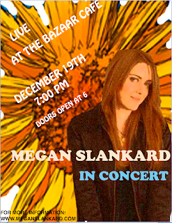
The next part of our sound portion of class was to design a music poster. I went in the complete opposite direction with my band, and went from a grunge, alternative rock band to a folk, acoustic guitar player names Megan Slankard. I originally saw her on television and have followed her music since. I know A couple of songs and always hunt for her CD when I am out.

Anyway, Her first album is a picture of her hidden behind a field of sunflowers, so I wanted to incorporate that into the poster. I found a picture of a sunflower and dragged it into photo shop. I used the magic eraser and erased all the edges so the sunflower looked like it was by itself, yet the petals had a bit of a zig-zag edge to them, in hopes to make it look like the sunflower exploded on the page. I found an image of Megan Slankard sitting on a chair. I originally wanted the image of her behind the flowers, but her face was extremely hidden so i thought this would be a better image. Again, I used the eraser tool and got rid of her bottom half, and the chair, plus all of the background color. I used a filter on the image to make it not so plain, and then put it on top of the sunflower. I was extremely proud that I was able to make the background a whole flower and make it pop without taking away from the rest of the poster, and use the tools and techniques I had learned in photo shop

In Quark, it was tricky to use the layering tool because it was different from photo shop. I wasn't sure where there was a new layer or not. I added text and then when I tried to change it, it would only create a new palette or style that I would have to click on to use. I found a puffy text that fit the style and mellowness of the artist and used that for the performance information. To make it not so static, I tilted the words to draw the eye up and into a Z. For the title, I found another simple font that added to the style of the artist and stuck with the shades of color I had been using elsewhere in the poster. I put the artist's name and in concert below here sort of near the bottom middle of the page, so as to be a little more creative and title the image of the artist present. I loved how all the text looked when it was completed. I am proud that I am able to make a poster that is not centered and stationary and actually create something I think looks nice and shows that I took time to work on it. It is really easy to make a poster with general information, but to make it eye catching was a lot of fun for me.

I also added on the bottom information where to go if you wanted more information, since It is always good to add that in case people have questions or want to know more about the event. I can see myself learning more and more about Mac's and design programs, and technology and I have never really gotten along before, but I and thoroughly enjoying all that I am learning and producing in this class.

Saturday, October 17, 2009

Music Slide Show

To date, this has been my favorite project we have worked on. We had to pick a band ad present a slide show featuring facts, the cd cover with track names and times, a table comparing the band I chose and a collage featurng a link to where you can find more information. I chose the band The Audition because I knew it would be a band no one knew and one that I could have a lot of fun with.

After the title slide was a slide with facts. I started by going into photoshop and creating a colored layered backgronund and filtered a photo of the lead singer onto it, and that became my background. I then found facts online and animated them in. I knew how to make things bounce and move in before but never how to make facts that were not prime dimmed, so poking around power point and doing research was huge for me this project. On this slide, I am most proud of making all the facts dim and all things moving by themselves.

The next slide was a picture of the album cover of my band and the tracks. I had a piano graphic along the bottomof my slide, as well as my album to the right of the info and my tracks, in a grunge manner, fly in, bounce into place, and state the title name and howlong each song is. This slide was the same deal as the prior one because I was not fully aware on how to dim the tracks before and make sure they didn't dim too fast before the next slide entered. I was really proud of how the fonts came out and of how smoothly this slide went.

The next slide was the chart. I decided to not look at ratings and numbers, but focus more on images that compared the for bands I picked, such as the band image and album covers. I also looked at the style of the music and the number of albums each band has released. Other than The Audition, I chose Paramore, The Backstreet Boys, and No Doubt. I was most proud of using the shape tool and creating my own chart instead of using a pre-made one that could be found on the internet. I enjoyed comparing the bands because they were each similar and different from one another, and how broad th spectrum of muic can be.

The final slide was a collage of pictures of the band I chose and a link where one can find more information about the band. I was super proud that I was able to time it so it stopped right when the slide show was done and also I was really proud of all the filters that I chose to use for the photos.

I also loved learning how to use audacity for the first time. It took a bit of getting used to because of all the buttons and features, but I really loved taking the songs I chose and cutting them into a seemless song that underscored my slide show. I learned so much during this project and it was so super simple to use. I have never been a wiz with a Mac and I feel like I can use programs with ease now.

Thursday, October 1, 2009

For the next part of our font poem, we had to create a video where our poem came over a collage that represented the words appearing. Due to technical difficulties, I did mine backwards. I made a video of my collage coming in and out, then once it was finished, the video flashed to my actual font poem, and then back so the reader could get a feel for my collage's representation of the words.

The poem is actually the lyrics from a song in the musical "Hair". The show is set in the 1960's and the words came from a song where the leading character, Claude, is about to make the decision if he should burn his draft card. The song is called "Where do I go" and I felt the words were extremely powerful as well as a good foundation to do crazy photo shop things to. The show itself is extremely colorful and full of hippies. I chose pictures of myself that echoed the words, such as myself in a dress covered in glitter, and a finger pointing down, or crazy hair that had been teased to represent the show and the gutter feel. also, lover's eyes and a shocked expression showing truth lies. I also thought it would be a nice touch to have part of my face painted, for a 60's feel. This was all set in front on neon, which isn't only a word in the poem but has the colorfulness that the show is about.