Out of the entire brochure, I worked on the three panels that were located inside. These included information about the playhouse itself, what some patrons said about their experiences at the playhouse, and a panel introducing the board of directors at the playhouse.
My target audience were those who would most likely attend the playhouse. If I had to choose an age group I would say more mature and older people since the brochure does not cater to children. The brochure was meant to be simply an introduction to the playhouse and a way to let current and future patrons know who we are, what we have done, and what they can look forward to in the future on our stage.
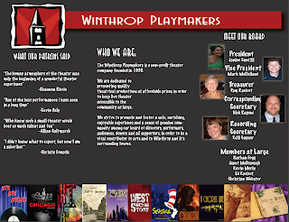
I set up each panel as a separate entity but I tried to include some pieces that made the inside united. The first panel was on the left side and it had quotes from those who had seen shows at the playhouse and what they thought of their experience. the middle panel had an about you section introducing people to the playhouse and I wanted to put that information in the middle panel because hat is the panel in the brochure when it is open that people's eye goes to first and foremost. The final side of the panel has the board of directors, including president, vice president, etc. all the way down to members at large . I wanted the brochure to speak in the simplest form and just let people know who the Winthrop Playmakers are. I feel like once that relationship is established, then it would be time to move on to more direct forms of getting people in to the theater.
I chose my color because it was what the Winthrop Playmakers currently has on the website. It is L21 gray and the images we used were pictures of the playhouse's logo and those on the board. across the bottom are images of plays the playhouse has done in the past in order to tie the three panels together. For the titles of each panel and the page, I used ITC Anna std because it was the closest font to what Winthrop had on their website and under that we used marker felt which gave what I felt, the Playmaker feel. Each font was Sans Serif since it is the easiest to read in the brochure.
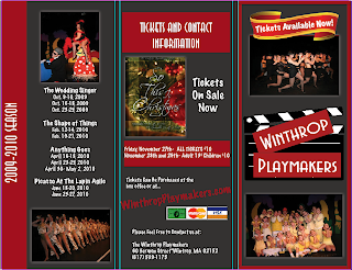
I am most proud of the pictures across the bottom of the page for sure and also being able to deliver a brochure that really helped advertise a place that I absolutely love. The playhouse is my second home and being able to help them advertise was great to me. Being able to design the brochure, using their fonts and colors, and also delivering a message was great. It was also great to see how I advanced from not knowing any adobe or mac products to being well knowledgeable in their products.
I wish I had more time to work on the panel with the board of directors since each photo was not nicely aligned with who they are on the board and also their photos looked a little fun house mirror. I worked on it a bit but with printer problems and computer malfunctions, what i changed did not save so I had to print as it was before the edits.
I really liked
InDesign
. It worked very well and I liked it better than Quark. I don't think I really had an trials or tribulations when working on this project.


