Monday, September 28, 2009

Font Poem


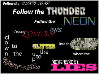
I choose this saying because for one, it is from a musical...surprise! I am a musical theater freak and this lyric comes from a song from the musical Hair. I recently worked on that show backstage and this song not only was super powerful and moving, but it was filled with words that i felt were great for a font poem because they were able to let you play around. The poem has words like thunder, neon, wind-song, city, gutter, glitter, etc. and i felt those words i could really show in different fonts and it just gave me a lot of room do experiment and do new things.


I chose the fonts I did because i felt that they captured the words' connotation. just a few for example. Truth was gaudy text which gave it a very honest and colonial feel and i felt that that kind of script delivered the message the best. Wind-song was shell Roundhand to give the word a wind-swept feeling. Thunder was Shuriken Boy to give the word the gracked, rounded feeling that thunder has. Neon was Serpintine with a multicolored glow to give it the reel of neon. Gutter was Strumpt with open words to make it feel tubey and dirty, especially with the brownish color. All my fonts were chosen sort of at random since i played around...alot to get a feeling of how the fonts and colors and such reflected the words and meanings of the poem.


I arranged the words the way I did so that they added to the feeling of the poem and were also legible. all of the follor phrases i had following each other on different layers to express that feeling. with lovers eyes, again, the in younr went almost through lovers to show in and i felt the juxtaposition of the words in that phrase added a lover feeling and passion. with down to the gutter and up to the glitter is is pretty self explanitory, i had to words going down and up to follor the path of the words. I had into the going into the city which was blazing broght, and lies was on the bottom of the page, flat with truth above it to express where truth lies. all the placement was established to make a flowing font poem while delivering a message, and to be creative aswell. I really wanted the viewer to be intrigued and wowed.


I didn't really encounter a lot of problems with this project as I did with the contact sheet. This was really eslf-explanatory and just dealt with trying out different fonts. the hardest part of the whole project thoughw as probably dealing with layers. instead of being able to grab something and move it, i had to go to that particular layer and tediously move letter by letter and word by word into place to form what the font poem looks like now. it was very slow work but resulted in something I am really happy with.


I am most proud of just accomplishing this and making something that i think is unique and beautiful. I did a lot of pressing buttons and hoping that it worked for most of the words and looked nice. and it all worked out. I loved being able to find fonts that reflected words in my poem and just creating what i did. If i had more time, I would take alook over everything I did to the poem so I oculd use these tools for next time this kind of thing turns up. I am very pleased with how my poem ended up.

Sunday, September 13, 2009

Contact Sheet


The first project for Electronic Communications was a contact sheet. This was a sheet made up of six different rows that showed examples of basic computer skills such as photo shop, pixels, zooms, and fonts. With each row I tried to find a unique picture, complete the assignment, and make it as unique and interesting as possible while learning new techniques.

The first row contains a picture that is 4 different dpi (dots per images). these went from 72, 300, 600, and 1200. The second row took a picture and dealt with color, from an image in the screen, an image if it was printed out, two tone and black and white photo. The third row dealt with a photo making it either landscape, square and portrait. The Fourth row dealt mostly with the zoom feature, and the fifth row had us zooming again, but not in the same style as the fourth row. the fourth row we focused mostly on different spots of a picture, but the fifth row was zoomed to the point of nonrecognition. The sixth row (in my opinion the most interesting) had us take a picture, go into photo shop and use different filters to make the photo of our choosing anything we want (I chose a picture from my time abroad in London and made it glow, cut out and grained).

In regards to this project, I wanted to create a contact sheet the was interesting to look at and was unique in the pictures chosen. That didn't work out so week with the first row since the butterfly I used has appeared in many other student's contact sheets before, but trying to find a photo that was originally 1200 dpi was like trying to find a needle in a hay stack, so I gave in and just used that one to get the message across.

I encountered problems because this is the first time that I have ever used photo shop or any of the other programs we used for this assignment. I do not own a mac nor have I ever used a mac for this purpose before so i was a bit worried in that regard, but luckily the instructions were really well delivered so after jotting down what i had to do and actually using the applications, it got easier as it went on. Row four, thus far has been the most problematic only because of a malfunctions image zoom, but I got there in the end


This project was a lot of fun because of the design aspect. Being a theater student and a fan of artsy things (math and science, thought necessary and interesting, really just isn't my thing), it was fun to find pictures that were different and make them different shapes, images, artistic representations etc. One of the reasons why I loved row 6 so much. also, I was glad I was able to learn these new programs. I have heard of photo shop many times in the past and how useful it can be, but again, being mac-less, have never used it or touched it, so being able to spend two weeks in class using this program was pretty awesome.

I am most proud of the fact that I was able to complete the assignment. I really wanted to learn something instead of sitting at a computer screen with the circuits malfunctioning in my head due to the complexity of the program. Being able to actually complete the project was probably a huge accomplishment for me and I was super proud. Another fun fact, technology and I sometimes have our differences. If I could got back and get more time for this project and change something, it would have to be that darn butterfly. I would have loved to find a different picture.


Hope You Like it!